Hello! 🌸 Spring has arrived with its share of good news: including our Product Update!! The features we’ve been talking about in our discussions are blossoming, helping you understand what your users are doing in production, but also how this is covered by your existing tests. Furthermore, knowing which operating system(s) and browser(s) your users are using can help you identify the most important combinations on which to run your tests. Let’s take a look at these new features, and what they can bring you in terms of “Quality Intelligence”.

Julien Botella
Understand which pages and page elements are most commonly used
For this Product Update, we worked on several complementary ways to see the gap between what happens in production and what is covered by your tests. On the page list, you are now able to see each page’s coverage. This is an entry point to drill down at a page level.

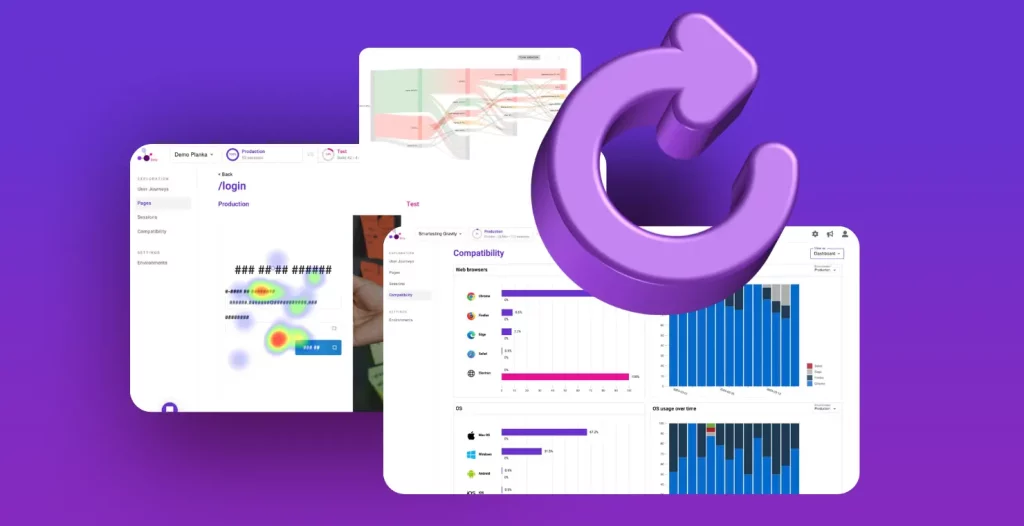
At a page level, let’s visualize the testing gap on a side-by-side heatmap. On the left, is what happens in production, on the right, is what is covered by your tests.

Another representation, in Gravity is called the “Interactions map”. It indicates which HTML elements used by your users in production are covered by your test sessions. An element often used may be under-tested, or an element rarely used over-tested, now you have concrete data to decide.

Define the level of impact of a page on your application, and obtain quadrants to decide what to test first
The frequency of production is an important factor to consider when prioritizing your tests. But you also have knowledge about what is critical for your application. Gravity now allows you to assign an “impact” score to each page, indicating its criticality for your purposes.

This impact score, combined with frequency in production and actual test coverage, allows us to present to you this new “Quadrant” visualization.

The more a page is on top, at right, on this quadrant, the more you should prioritize testing it.
If you want to try these features, book a Gravity Demo and get started!!!
Visualize which user’s journeys are covered by your tests
Previous representations give you a view of what happens on each page, independently. This level of information is completed by the feature we presented to you last December: User Journeys and Sankey diagram representation. In this representation, the test coverage dimension was not present yet. We now present it directly in the Sankey diagram, to let you decide which user journey should be the next one to cover by your tests.

Understand the conditions under which your users access your application
Now that we know the testing gap, one more information you asked for, is the context of usage of your application. A compatibility dashboard enables you to see which are the most common web browsers and OSs used by your users, and their evolution over time. On the same page you will figure out if your tests are running on the same configurations.

One step further, you can also take a look at the OS x Browser combinations.

See you soon on Gravity?
Stay tuned, based on those new visualizations, we will continue to offer capabilities to help you better than ever to decide what you want to test! It remains for me to wish you a very happy Easter 🐰, hoping to see you soon on Gravity. Stay connected for our next product update!!
Want to see Gravity in action? Want to start using it on your project? Please ask for a demo!


